
A deep dive with examples on when to use them
Wally Wood famously once said “never draw anything you can copy, never copy anything you can trace, never trace anything you can cut out and paste up.”
The legendary comic book artist strived for efficiency in his work. When page rates are low and deadlines are looming, the ability to churn out high quality work at speed is essential. To that end, he created a cheat sheet that is arguably as well known, if not more well known than the man himself.
Here are Wally Wood’s 22 panels that always work explained …
Big head
Pretty much the entire opening of the Frank Miller’s Dark Knight Returns is dedicated to this first example. We have Bruce Wayne side on, head on, three quarter profile, we have the news reporter. Even the crash is composed to resemble Bruce in his helmet.
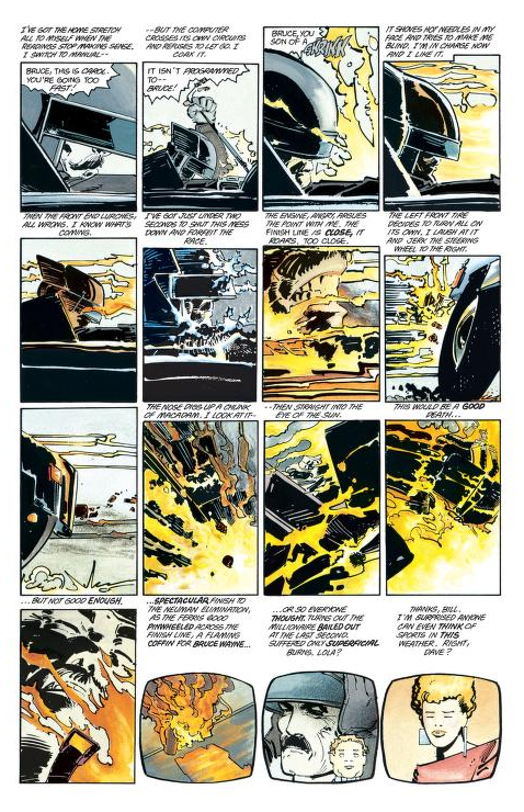
Miller repeats it across the first few pages allowing us to hyper focus on the characters and how the story is impacting them. It literally and metaphorically brings us closer to that character. It allows us see the character clearer and peer into their thoughts and emotions.

Brian Bolland uses a “big head” panel to great effect in the Killing Joke to show the fear and trauma of Barbra Gordon as she recovers in hospital from the Joker’s brutal attack.
Extreme close-up
This is the big head on steroids and allows us to zero-in on a specific reaction or emotion, bringing us even closer to that character and intensifying that feeling.

You can see this at play in O’Barr’s the Crow. The panels get tighter and tighter on the Crow’s face as the scene gets more intense and the mania of the character grows.

You can also use it to narrow in on a specific detail or feature that you want to highlight. Raina Telgemeier’s tale of a girl’s struggle with life and braces has many extreme close-ups that allow us to hyper-focus only the relevant detail we need to pay attention to.
Back of head / front of head
This is your standard set-up for a conversation. It allows you to focus on two character’s talking while putting the attention on the character whose face we can see.
Profile no background
Removing the background means more attention on the characters. You can also spice up the panel by playing with the composition slightly. In the rooftop meeting between Batman, Jim Gordon, and Harvey Dent in the Long Halloween, Tim Sale is able to communicate the change in attitude the characters have towards one another as the scene progresses. The begin all facing different directions as they literally can’t see eye-to-eye on how to deal with organized crime in Gotham.

As the scene progresses and an agreement is reached, they begin to face one-another.

Light background, dark foreground
This is a great way to build atmosphere and a creates a separation between the world in the foreground and the world in the background. This divide can highlight a difference in emotion or circumstances between to characters.

Open panel, complete object
An open panel breaks free from the structure of the book. It makes an object stand alone and draws your eye to it. It can create a sense of endless space without borders. That can translate into endless possibility, timelessness, or loneliness and isolation.

All black
I probably could have used the example above for this one, or practically any panel from Sin City but that felt like cheating. All black works as a contrast to the white panels around it. In Sin City, the opposite is true. So much of it is all black that it’s the white panels that stand out.
But for a page with a large amount of white, or detailed backgrounds and panels, a stripped down version stands out on the page.

One big object
Unsurprisingly, this showcases the importance of the object by having it be the focus.

More than that though, by making it bigger than the other character in the scene it can make it seem extra important, more threatening, more powerful, than the character.

Putting the object in the foreground and shrinking the character in comparison can show the power the object has over them.
Full figure, open panel
Much the same as the object in an open panel, the full figure breaks out of the confines of the comic page structure.

Above, Miller and Mazzucchelli use this break to make Daredevil’s blow more impactful as he literally smashes out of the panel structure.

In Maus, Spiegelman uses open panels to separate timelines. The present day conversations with Art and his father are outside the structure of the story being told, and so, do not get a panel border.

Others use this separation to create a sense of loneliness and isolation.
Reverse silhouette
This is where everything around the character is silhouetted instead of them being silhouetted.

Small figure
This can give a sense of grandeur to the surrounding objects in the panel. A small character surrounded by big buildings, statues, or even monsters can make the scene appear epic by comparison.

Depth
This can make the world feel more grounded and lived in, as though there is more to be seen just off the edges of the panel.

Down shot, cast shadows
This can give the feeling that we are spying on the scene, maybe looking at it from out of our bedroom windows. By extension, it can make it seem like the character is being watched by someone else.

L-shape and silhouette

Diagram eye-level
This puts you in the scene with them, as though you could walk over and join them.

Side lit or top
Great for creating atmosphere or suspenseful images.

Reflection
What could be better than one character in a panel? That’s right, the same one again. More than just doubling up, reflections can add symmetry to a panel which can make it more visually appealing.

Frame
This is another way to create added focus on a character or object by creating a panel within the panel where you can put the most essential elements you want people to pay attention to.

Light background and silhouette
Similar to the light background and dark foreground, this is great at creating atmosphere while adding more focus to the visible elements.

Tim Sale uses the silhouette to also frame the focal points of the panel.
Three stage
This is another way to add depth and richness to the world inside the panel. The zones or stages it creates can tell a story on their own too. With each area being an almost different scene.

In Spider-Man No More, Romita shows Peter in the middle ground moving from the trash filled alley in the foreground, to the city in the background. His Spider-Man costume is thrown in the trash, it’s the past Peter wants to abandon and all the garbage that comes with it. Normal life awaits, and hopefully happiness with it. But, Peter isn’t there yet. He’s still between these worlds and his posture tells us all we need to know about how he is feeling.
Other media
Another way to build out the world of your story. By including in-world media, it can show that the non-central characters are experiencing these events as well and that there is a whole population of characters beyond the scope of the narrative with lives of their own.

Whether that’s delivering exposition through TV screens and newspapers, or fabricating entire books, comics, novels, and tabloids in Watchmen to expand on the mythos.

Contrast
High contrast is the defining look of noir cinema and can transpose that tension and feeling into your comic.

What next
Take a look at some of your favorite comics and see how many examples you can pick out of the different panels types. If you are working on your own comic, see if there are any panels you could add or swap out to make things more interesting for your readers.
Our latest book
David Fincher’s Se7en crossed with X-Men’s Shadow King

140 pages of suspense as journalist, Lina Santos, hunts for a child abductor no-one believes exists.
Want great content straight to your inbox?
Sign up for our newsletter and be the first to receive articles, tips, and news.


More to read

Creating beautiful women – A colorists guide
Whether you prefer a natural look, bold colors, or something in-between, one thing is for sure, men and women have been using make-up to augment their appearance for centuries. Doing the same in your coloring can add another level to your characters.
Keep reading
Using FACS to create emotions
A breakdown of 64 unique movements that the muscles in your head are capable of making and how to combine them to create realistic emotions in your art.
Keep reading
