The Ultimate Beginners Guide To Comic Design
by Maureen Sindiga
In this post, we’ll go over the fundamentals of color theory for comic artists, color schemes, and tried-and-true tips for creating vibrant and aesthetically appealing color schemes for your next project.
What is Color Theory?
Color theory is the technique of blending colors using the color wheel in a way that is visually appealing, combining primary, secondary, and tertiary colors in a way that elevates the work and adds depth and resonance. Artists, designers, marketers, and brand owners must be able to combine colors accurately, use the color wheel, and comprehend how colors relate to one another.
Understanding the Color Wheel
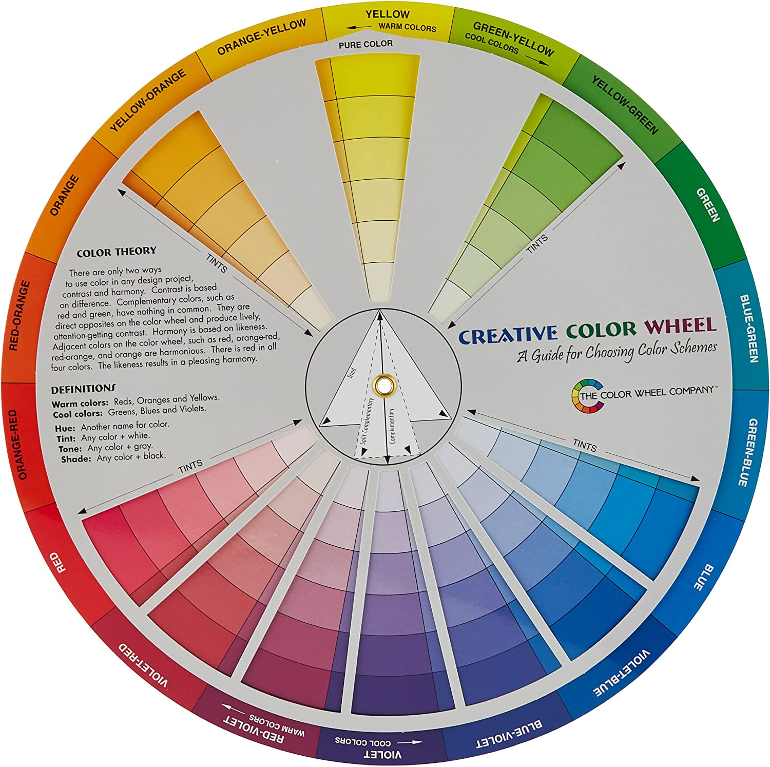
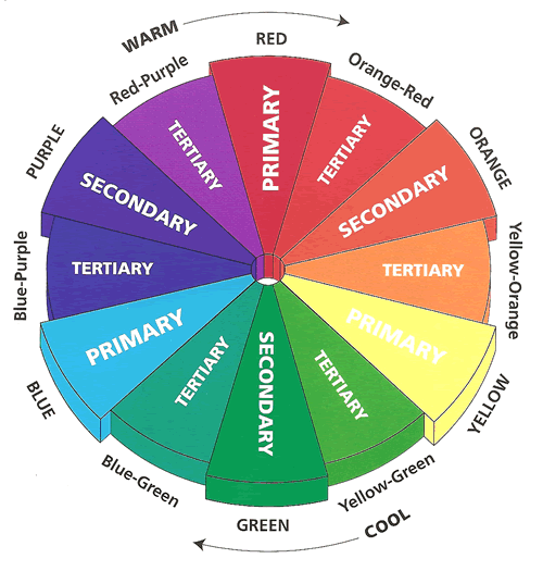
The color wheel demonstrates how multiple colors relate to one another and how you can blend them. The color circle is often constructed using primary, secondary, and tertiary colors. The primary pigment colors are those that any other color combination cannot create.
When we combine primary colors, we obtain secondary colors. When we combine primary and secondary colors, we get tertiary colors, which commonly have two-word names like red-green ( a combination of red and green).
A basic color wheel has 12 colors, all of which are combinations of the three primary colors. In printing these are red, yellow, and blue. The three major colors are the progenitors of the other colors on the spectrum.
Using the Color Wheel To Create Color Schemes
A color wheel can produce four color schemes, and whatever you choose hinges on whether you want to create a bold or harmonious piece.
- Analogous Color schemes
An analogous color scheme is when you pick a collection of colors, tints, or tones (typically three) that are next to or highly similar to one another on the wheel. For example, red sits adjacent to rust, which is near terracotta. The outcome is pleasing to the eye and immediately recognizable. This natural mixing is found in nature, rendering the combo incredibly calming and fostering a sense of tranquility.
- Complementary Color Schemes
You have complementary color schemes on the opposite of the analogous colors. These entail selecting complementary hues from the other side of the color wheel, such as pinks and greens or oranges and blues. The end outcome is a combo that is vibrant and pops out.
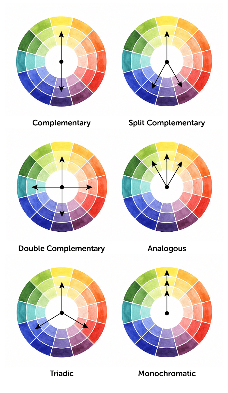
- Monochromatic Color Schemes
A monochromatic scheme involves using a single color (for example, grey) in various tones, tints, and hues. The ultimate result is a harmonious, aesthetically coherent appearance.
- Achromatic Color Schemes
The term achromatic refers to a color scheme that is devoid of color. It refers to a color scheme that combines whites, blacks, and grays. This is the one to go for if you want a minimalist style. A bit of color in the undertone is always an option to avoid lifeless results.
Four Tips For Choosing A Grand Color Scheme
- Set the Tone For Your Color Palette
Consider the atmosphere and tone you desire in your color palette. Use reds or brilliant yellows if energy, pop, and enthusiasm are essential to you.
Choose softer or darker blues, purples, and greens if you want to generate a sense of calmness, serenity, or tranquility.
- Make Use of Your Color Wheel
Review your color wheel and the color combinations you’ve settled on. Choose a few varying color schemes, such as monochromatic, complimentary, and triad, to see what sticks out.
The objective here is to acquire a feeling of which design organically corresponds to your subjective view and the appearance of your comic
You might even discover that designs that are appealing in concept may not fit with your comic design. This is a natural part of the process; trial and error will assist you in selecting the color palette that accentuates your content while improving the user experience.
- Apply the 60-30-10 Guideline
The concept is to combine three colors:
- A primary color for 60% of your work
- A secondary color for 30%
- A supplementary color for the remaining 10%
These add a feeling of symmetry and perspective to your comic.
- Create Several Designs
Create and test different color schemes for your website to determine which one(s) stands out. Then, step back, wait a few days, and check to see whether your preferences have changed.
This is why: While many creators go in with a concept of what they wish to see and whatever looks beautiful, the ultimate product often differs from physical color wheels on digital displays. What appeared to be an excellent complement or a unique color pop may seem dreary or outmoded.
Don’t be afraid to draft, evaluate, and draft again. Toss away what doesn’t work and go with what you like.
Bottom Line: Color Theory
Color is one of the many techniques comic book artists like experimenting with. At the same time, it is one of the more difficult instruments to learn. The knowledge and tips presented above will help you get started, but the only way to progress is to practice and master the skill of making beautiful color combinations.
What next
That was our quick guide to creating a made-up look for you characters. To take this further, try coloring your own characters. Experiment with different shades and see how they impact their look. Try out different skin tones too.
Our latest book
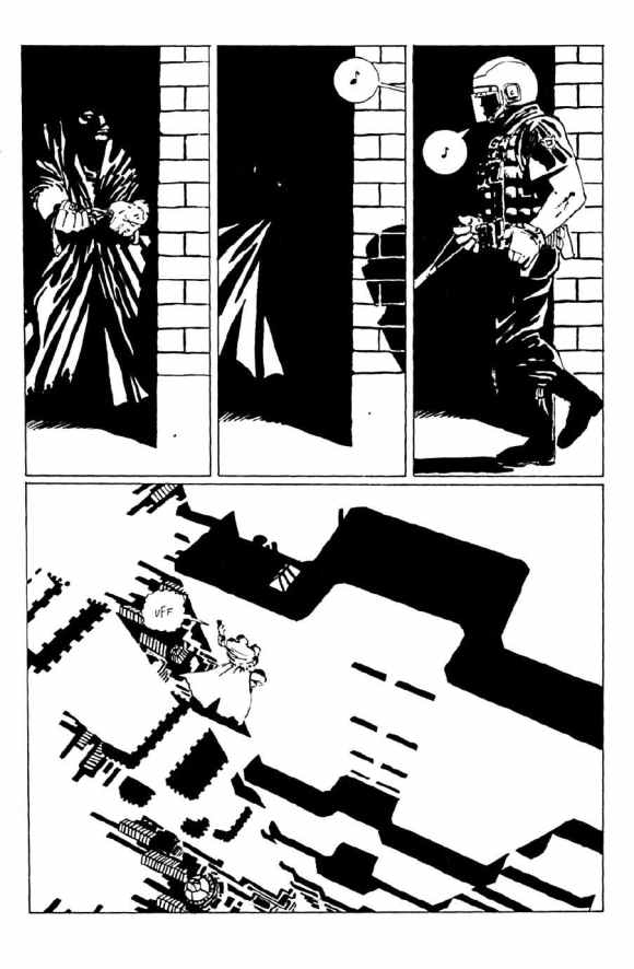
David Fincher’s Se7en crossed with X-Men’s Shadow King

140 pages of suspense as journalist, Lina Santos, hunts for a child abductor no-one believes exists.
Want great content straight to your inbox?
Sign up for our newsletter and be the first to receive articles, tips, and news.


More to read

How to compose a comic panel
From the Ancient Greeks to the New Gods, from the Leonardo DaVinci to Leonardo the Turtle, composition has always been an essential component of art. It is the difference between something being drawn accurately and something being drawn beautifully. So, what is the secret to great composition?
Keep readingGray Cells Free Issue
A supernatural / neo-noir thriller Gray Cells is a dark tale that plays into the fears that we have in the modern world. A distrust of authority, competing versions of reality and losing the sense of what is true and what is a lie. Our antagonist twists the minds of his victims, making them see…
Keep reading
Creating beautiful women – A colorists guide
Whether you prefer a natural look, bold colors, or something in-between, one thing is for sure, men and women have been using make-up to augment their appearance for centuries. Doing the same in your coloring can add another level to your characters.
Keep reading